There is so much you can achieve with digitally printing textiles. Including a huge variety of colours, intricate detail, beautiful photographic translations of texture and contrasts. The scale of artwork is restricted to the width of the fabric only and you can design incredible placement prints weather for a dress or a pair of curtains.
As with all textile technology it has strengths and weaknesses so we wanted to let you know what we have learnt as a Top Three to do and to avoid!
To Do
- SET UP FILES CORRECTLY
The most important thing in getting a great result is setting up files correctly from the beginning. Each printer will have a different work flow of how they like files to be. Remembering that your work is part of that flow, is a crucial step in getting the desired outcome. - UNDERSTAND THE TECHNOLOGY
Great design works to the strength of the technology that is supporting the execution of the design. Working to the strength of that technology will give you the best result. Working with colour, gradient, texture all demonstrates the strength and individuality of digital printing. Different fabrics have different characteristics; they could be light weight and full of lustre or matte finish and heavy duty. Taking this into consideration when designing will always enhance your outcome. Remembering that the transfer of inks and dyes onto a textile is a physical process and that what you see as an image on a screen is a very different way of viewing a design.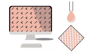
- SAMPLE
Trial or sample first. Create a file that is characteristic of your design work. Use different colours, textures and images that you intend to work with. By printing this it guides you to see what looks great and what does not work like you intended with your design. Printing a sample of an artwork before you go to bulk printing will always provide an insight into the finished product and allow you to make changes to the work. Always ask the printer if they can see any potential areas that may not translate as intended
To Avoid
- AVOID LARGE AREAS OF DARK COLOUR
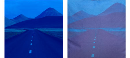
When printing, we lay down ink onto the surface of the fabric to create the image. Large areas of dark flat printed colour do not always print with the same intensity you see on a screen. Depending on the fabric, printed blacks can appear a little more vintage. This is because we print onto the fabric as a pose to a dyed fabric which has been immersed into a dye bath. Breaking up large dark areas of print tends to look better. - AVOID SUBTLE TONE VARIATIONS
When we view images on our screens they are projected at us from a light source in a high resolution. Subtle colour variations are easily decipherable and lots of different tones in dark colours can be seen. When we translate that from a projected image to the world of ink and textiles, subtle variations are not always translatable. On a screen where you may see three similar shades of grey may appear as a solid grey in textiles. It is good to create more contrast in designs when placing similar colours next to each other.
- AVOID LOW QUALITY IMAGES
A low quality pixelated image will print as a low quality pixelated print. When creating your design if the initial artwork or image is low quality, in the print it will reproduce as that. Always make sure images are at the 1:1 scale you will be printing them at.