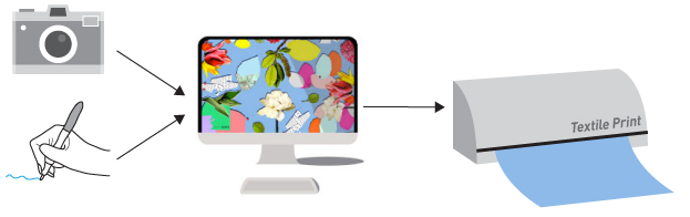
Using digital printing we can replicate images that use thousands of colours and create sharp, detailed textile designs. However, the colours you see in a digital file on your computer screen are not always how they will translate to a textile.
Your computer or tablet is presenting colour to you in an illuminated source, it can replicate fluro, extreme saturation and high colour density. When a fabric is digitally printed ink is being printed onto the surface of a textile and some of the colours you see on screen will be slightly different when printed. This is partly due to that fact that a textile is a tactile and physical sample and partly due to a printer not being able to replicate all of the colours that a digital screen can.
It is also important to remember that not all computer screens show colour in the same way.
We get asked a lot “will my fabric look the same as it does on screen?” A simple answer is no, however it will look very similar, as that is the purpose of the highly powerful printers to replicate an image to the best reproduction it can
There are a few things you can do as a designer to ensure you get as close as possible to the colours you want and have a controlled and realistic expected outcome for how the fabric will appear once printed.
Colour management relates to controlling the final outcome from all the design inputs
Sample
There is no better way to test an artwork than to print it, you can then review a printed length and make any adjustments you need. We highly recommend this if you will be doing a bulk order.
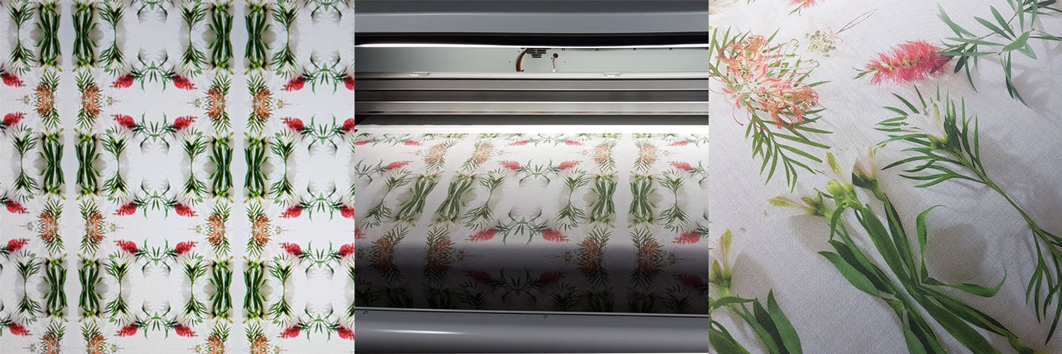
Sampling an artwork onto the textiles is an important step if you are printing a bulk production
Colour Chart
If specific colours are really important for you artwork or product development we recommend using one of our Pantone Colour Charts to colour match with. Each fabric will print differently, so you can print our pantone colour chart onto the fabric of your choice and use that to select the colours you want.
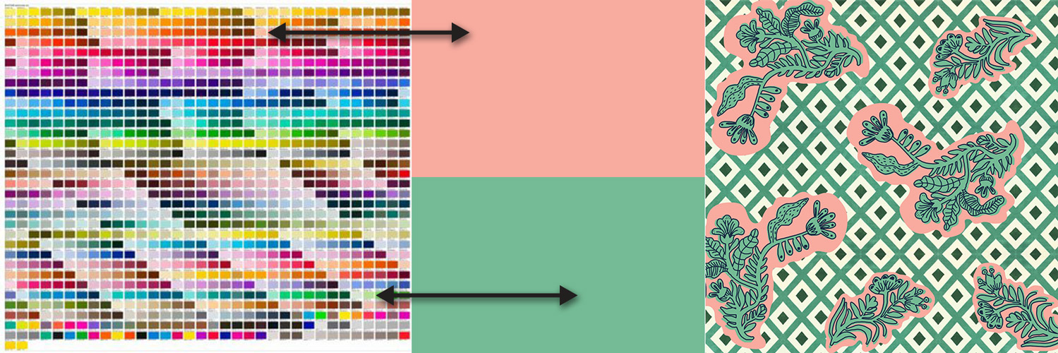
By selecting colour off a colour chart on printed fabric you have an expected out come for how it will print in your design
Design for Digital
To get the best results it is always a great idea to design to the strength of the technology you are working with. Digital Printing is designed to print thousands of colours and details. We find the artwork that works best has great contrast, uses multiple colours and detail in the design. The weakest element to digital printing is printing large areas of singular solid colours or low contrast images. While it still works and can look effective it is worth understanding the strengths of the printing process.
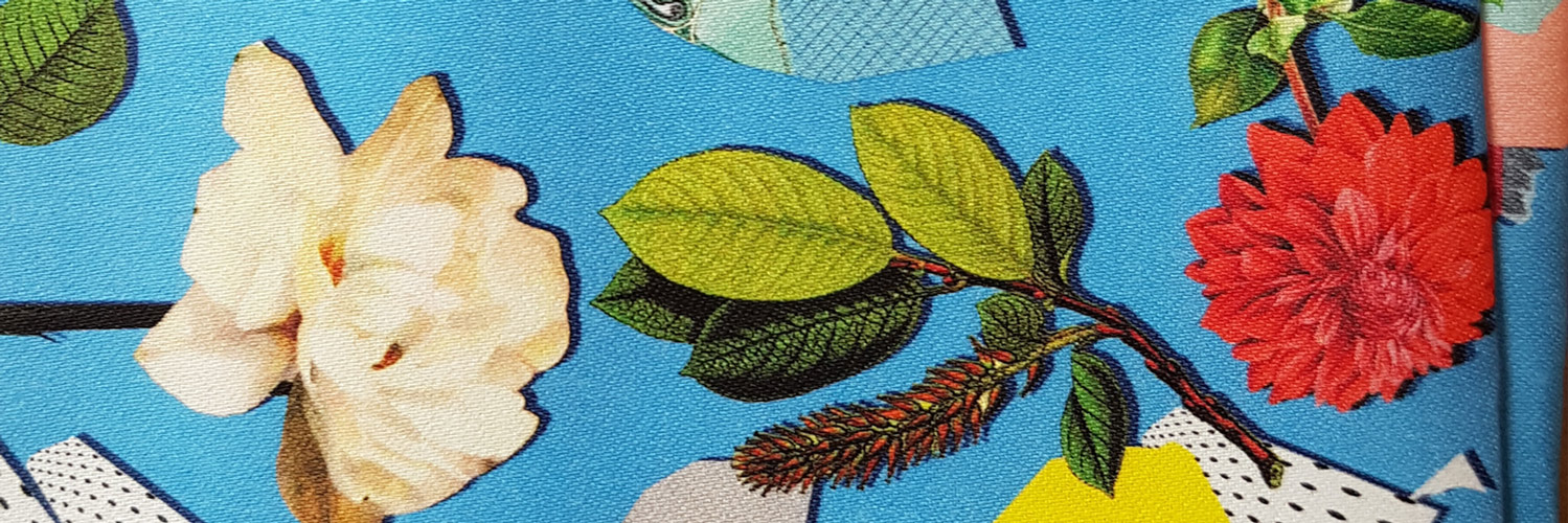
Artwork containing photos, illustrations, solid colour and fine detail printed on Sateen
File Management
How you create your file plays an important role in the outcome of colours. The below are important thing to consider;
- Create your new artwork as RGB, do not convert it at the end when saving.
- Design in a minimum of 150 Pixels Per Inch
- If working in Photoshop make sure to flatten all layers before saving a file for print.