
The quality of your print relies on the quality of your file. You can print any file you want onto a textile; however certain characteristics of a file will work better in print. We’d like to share common best practice in a file as well as dive into the most common file issues we see.
The Best Of Digital
When taking a digital file and printing it onto a fabric you will get a relative translation to what you see on screen. Digital printing is great with recreating files that utilise:
- Lots of Colour
- Texture
- Painterly details
- Photographic images
- Large scale works
- Fine lines and lots of detail
Digital Limitations
When taking a file from a backlit digital screen to a light absorbing textile there will be variation in what will print. The best way to check if your file will present any challenges is by sampling the file on fabric and you will get a solid understanding of how it translates. Digital printing can have limitations, being aware of them and designing accordingly can make a real difference to your print outcome.
- Low contrast images or two very dark colours next to each other on screen don’t always look the same on fabric. Solution: Heighten colour contrast so difference is more prominent.
- Neon and Fluro colours don’t print, the mixing of inks is such that these colours can’t physically be printed. As a result, neon colours in files can print a bit darker. Solution: Lightening off the neon colours as bright pastels is more effective in reproducing the effect than using darker tones. Also increase contrast in the overall file to create more variation in colour.
- Printing solid colours over the whole fabric. The base of our fabrics are a white or light colour, and the ink is applied to the surface of the textile. When printing a solid colour all over it is good to be aware that it will not look like a dyed textile that has been fully immersed in a dye bath. The printed colour will only be on one side of the fabric.
Resolution And Scale
If you have a small image and you want to make it large, chances are it may appear pixelated. Depending on what you are doing it may not matter, however pixelation in an image is a sign that the initial artwork was low resolution. A great way to combat pixelation is to make the original file as close as possible to the scale you would like to print it at.
Once a file has been made at a certain scale and pixel density, you cannot force more information and detail into the file to allow it to scale up as a perfect image without degradation.
Our Fabric Creator scale tool has a little indicator to help you understand if an image will potentially be pixelated in print.
Repeating Prints
If your file is a repeating print you need to thoroughly check that all edges of the file will match. Top to bottom and left to right.
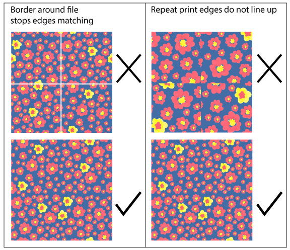
A common mistake we see is a thin border around a repeating pattern, more common when the print is a vector image or designed in Illustrator. Borders — even the very thin ones — show up when printed on fabric.
To identify this fault, you need to zoom in to each corner of your file so you can see the individual pixels squares and make sure the colour around the edges is matching to the main pattern body.
Solution: If you find your file has a border around it, you can crop up to two edge pixels off and we find it does not impact on the pattern repeat. Or you can colour the edges in to match the main pattern
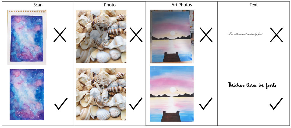
Scanned Files
If you have an original illustration you are scanning for print it is recommended to check the scan is a nice clean file. If you have sketchy hand marks or pencil lines in the scan, they will print in the file. After scanning you may need to edit the file and remove any unwanted areas.
Printing Photographs
When taking a photo you plan on printing check for shadows, especially your hand taking the photo and watch for blurring.
If you are taking photos on your phone for printing be conscious of blowing them up too big, if pixelation is an issue for you. Many phone cameras take photos at 72PPI, however in a centimetre size, they do tend to be big. We print phone photos all the time and they render lovely print results.
Printing Photos Of Artwork
If you have an original painting you have photographed and plan to print, a few key considerations can make all the difference:
- Avoid Shadows on the artwork
- Try not to photograph the background behind the painting unless you plan to crop it out.
- Avoid light variation in the photo so certain parts of the painting don’t appear to shiny
- Try to take the photo at a balanced height so it isn’t warped in scale.
- Make sure there is no blurring in the photo.
Printing Text
When you transfer text from a screen to a textile you need to remember that a textile is textured, and this can interfere with the way a font may appear and be readable.
We recommend you avoid printing fonts under a size 12, especially if the font is thin and curly. Smaller fonts work better on flat surfaces like our Classic Cotton.
To be sure on how your font will look, we recommend printing a test swatch.