Colour management refers to the way your inputs (photos, scans, digital illustrations) transform from a digital space to physical printed space. How do you get as close as possible to the colour on screen and how do you print a specific colour.
Colour In Files
Colour is a big area of understanding in any design field. Realistically you can not worry too much and if you love what you see on screen you can print it and you’ll get a relative translation to textiles. If you are not ready for the technical details or if they don’t matter to what you are doing, seriously, don’t worry.
If you are trying to get specific colour matches or need to know more, we have covered some popular topics.
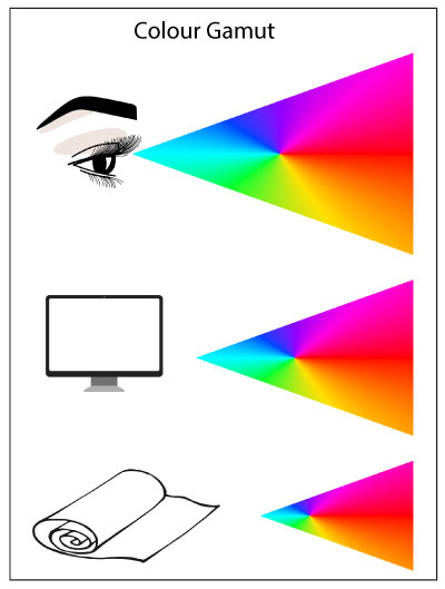
Colour Gamut
A Colour Gamut refers to what is possible to view and print. Our eye can perceive millions of colours, a screen can project a vast array of colours, in print the achievable gamut of colours in much smaller, so certain colours just cannot print. The printer will shift colours as close as possible to what it can print. This is where you see variation in file colours, fluro colours for example are out of a printable gamut.
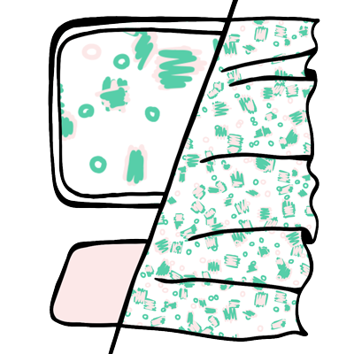
Different Fabric Different Colour
If you print the same yellow on all our different fabrics, you will get a slightly different translation. This is because all fabrics have a different fibre composition, weave construction, yarn width and base colour. It is reasonable to expect a yellow printed on an oatmeal fabric to look different to a white base colour. Likewise a Polyester and a Cotton fabric use different print techniques and will print differently.

How To Get A Colour Match
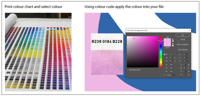
To match a colour you need to see it printed on the exact fabric you plan to use.
- Order a Next State Colour Chart on your chosen fabric.
- Select the colours that you like off the chart.
- Using the colour code apply that colour into your digital file
This very specific method of colour matching is managed via the use of our Next State Colour Charts.
You can create your own colour chart/map files by printing all the different colours you like working with onto fabric. You must ensure that the colour mode and file type of test files, match final saved files.
As a note, colour matching can be a challenge, often taking a few goes to get right. How you view colour in natural or artificial light and on what fabric all change the perception of a colour. It is good to work towards getting something as close and best as possible. Being exacting is not always possible.